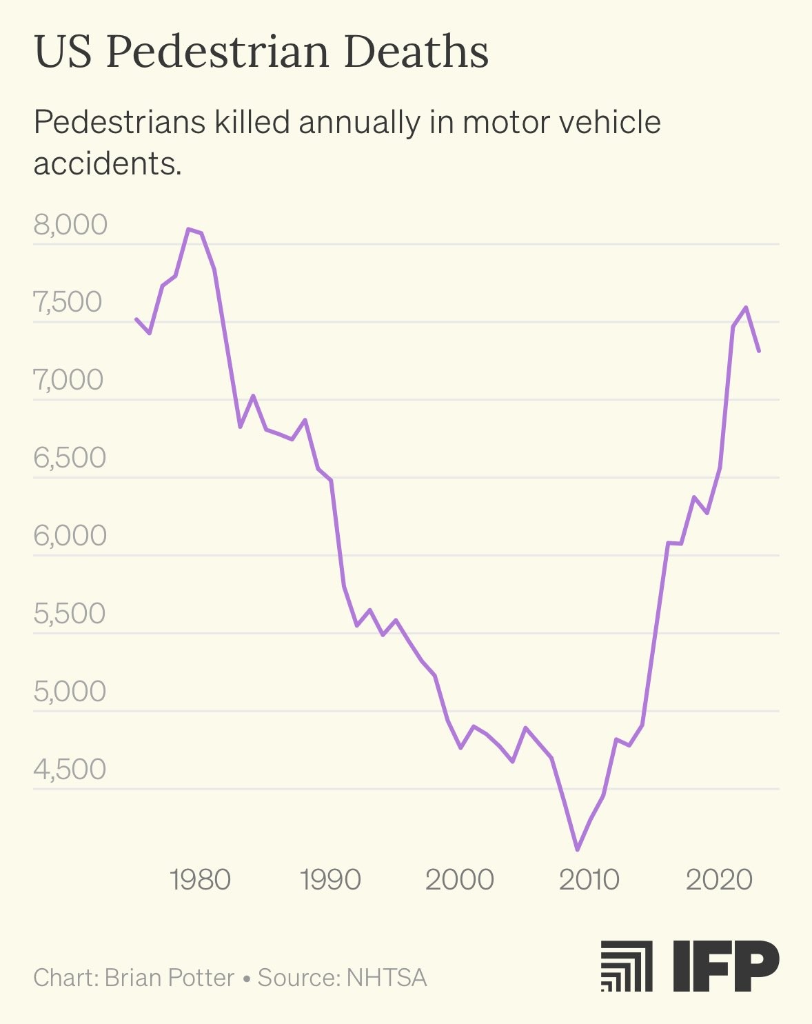
I just checked the data for Germany and it doesn’t reflect the same trend. Could be that Germany is more pedestrian friendly. There is no upwards trend visible from 2007, when smartphones became mainstream. But, you can see a clear drop in pedestrian deaths accidents caused by traffic during the pandemic.
Edit: Little mistake from me, this statistic shows pedestrian accidents, not deaths. Still comparable though.
Could also be a mentality thing, if you can mentally put down the phone and not text. Or hell an automatic/manual transmission thing, can’t use the phone if you have to shift.


I just checked the data for Germany and it doesn’t reflect the same trend. Could be that Germany is more pedestrian friendly. There is no upwards trend visible from 2007, when smartphones became mainstream. But, you can see a clear drop in pedestrian
deathsaccidents caused by traffic during the pandemic.Edit: Little mistake from me, this statistic shows pedestrian accidents, not deaths. Still comparable though.
Why is this graph sideways
Its physically painful to look at.
i feel the same way every morning when i look in the mirror.
Stop doing what doesn’t serve you.
The more I look at it, the worse it gets
When corporate commands all charts must be up and to the right
And the years are counting down.
There is an option to rotate it on the site, but it doesn’t work for me. Sorry about that.
This next question isn’t for you, but if you could pass it along to the website owners, that would be great.
WHAT THE HELL IS WRONG WITH YOUR GRAPHS??? WHY IS THE DEFAULT VIEW SIDEWAYS???
Its German.
Because any values can be on X or Y axis.
99.9% of reasonable graph makers put the linear value (like years) on the x axis, and the variable value on the y axis…
I guess Germany isn’t as much into SUVs
What in the ever living abscissa is this graph?
Could also be a mentality thing, if you can mentally put down the phone and not text. Or hell an automatic/manual transmission thing, can’t use the phone if you have to shift.