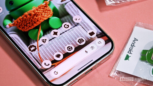
All your icons should not be the same two three four colors. It gets harder to distinguish one app from another. It all becomes noise functionally.
I don’t know how I feel about this. While easier icon theming is a good thing, I don’t think more power to Google is desirable.
We need less control from Google over the Android ecosystem, not more.
This seems to be more power to the user, not sure how it is more power to google other than them enforcing it, which they already have power to do because of ownership of the de facto app store.
Exactly.
Many apps don’t let their icon be themed because muh brand identity.
This is enforcing using choice, so if a user enables the Themed Icons setting they can be sure every app installed will follow it.
Yea, fuck google but on the other hand, why would a developer care if I theme the icon?
Adwaita dev enters the chat
The Adwaita team, and a bunch of devs that make Adwaita apps explicitly said that theming their apps is fine, they simply asked for users who theme their apps not to submit bug reports that are actually just theming issues.
There’s nothing worse than spending hours and hours trying to replicate or resolve a bug, only to find out it’s because the user installed an anime girl theme that’s caused some issue.
Those devs were completely right to put out that request, and I think it’s wrong that they received a lot of hate for it.
They are open source devs, donating their time to give you software for free. Is it really that bad they politely ask not to receive time-wasting bug reports for things that they never broke in the first place?
You are not exactly correct:
Source https://stopthemingmy.app/
If you are a distribution who changes the system stylesheet and icons, please reconsider this decision.
This is an attack on Linux mint and Garuda to ask them to not theme their apps.
On top of that Adwaita has not been very well supported in kde via flatpak, thanks to the exclusionary nature of gnome devs
I also don’t know. The user in me loves this because it’s bloody annoying to see the few eye sores on my home screen that don’t conform to my theme. But the developer in me sympathizes with icon designers who have to make icons that can easily be themed, and companies (or individuals!) that may have to compromise on their brand.
Having a single color rendition of your logo is good practice anyway (you can’t always print stuff in full color and it has all sorts of UX and branding uses). I can’t imagine of all the compliance requirements for apps going into the svg for your icon and making it black and white is the dealbreaker.
Plus in practice the Android apps that refuse to comply are Amazon, my banking apps and believe it or not my phone manufacturer’s first party apps (and I believe Facebook, but I don’t have that installed, so I’m not sure).
I say eff that. Work within the OS requirements for customization. I don’t care if it’s Linux, Android, Windows or whatever else. Let me set up my device the way I want it.
Too late. I already use a launcher that lets me do this.
Well, this seems in line with their whole Material 3 crapfest. I have a small personal SPA based on Angular Material 2. I’ve chosen some nice colours and use them troughout the site for a recognizable style.
With Material 3 you can pick a colour, or if you ask very nicely, maybe 5. And then the framework will generate the colours for the components. These generated colours are almost, but not quite, entirely unlike the colours you picked. Making your site look like an fugly mess.
Their grand “vision” is that they should match the content or whatever wallpaper the user has. So fuck you and your colours, we know better. It was quite a frustrating experiment and for now I’m back on Material 2 looking to switch to something better.
I liked the idea of Material 3 until they made it basically impossible to choose your own colours. What’s worse, power users found a way to do it and they patched it
why is google so deadset on destroying android?
How does this destroy android, exactly?
forcing design language
removing developer choice
ending sideloading
you name it
Oh no! Anyways, I could not care less.
Why the hell would I want all my icons to have a theme? It’s easier to find apps when they have different icons. I have priobably hundred i cons on every device.
So turn that off. It’s always optional for users, this is about developers complying with the system-wide option.
I do turn on themed icons and it’s so annoying to have one random one in the middle that refuses to listen that I now bundle my apps into folders based on whether they comply with icon theming or not.
Reading it, it comes off as useful for me.
During the more chaotic days of Android, some apps had a circle icon. Others had a minor border radius. Some were just full blown squares or transparent logos.
App logos on the iPhone had consistency.
I’m not seeing why this is a bad thing.
I agree, I don’t need to show off how much time I spent configuring my phone with neon icons. I just want to use it!
I tried themes and was annoyed by the added difficulty in telling icons apart and the couple of icons that aren’t in the theme and so stick out like a sore thumb.
Then don’t adjust the theme?
I don’t! I tried it and didn’t like it.
Because daddy Google decided that’s better for you of course! Daddy Google knows best after all!🤦♂️


