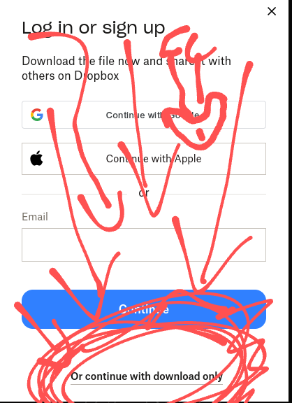
Or continue with download only
I mean, the bypass isn’t exactly hidden.
No, come on. This is a dark pattern. It’s easy for someone technically-inclined, but most users see only the big obvious buttons and skip right over what looks like it could just be an irrelevant footnote at the bottom. My parents would absolutely end up creating accounts and be frustrated about it, but I’m also willing to bet most of my friends who aren’t in tech would do the same.
Maybe you should highlight it with a red circle, because I still don’t see it.

needs few circles around the X in the corner too.
bonus points for subtly hidden dick and balls, though
Oh, Oooh. NOW I SEE IT!
The problem is that they needed to have that big blue button be the download, and the “log in or sign up” should be that small, black text below it.
Better for the UX, and less of a dark pattern.
Get new eyes
Your free trial of Eyesight Pro™ includes full resolution and color for 7 days, after which you will pay $39.99/second. To cancel your free trial, click the transparent button below.
I’ve been on enough sketchy websites to find the real download link
Yes. Just weird for Dropbox to be doing it.
Back in my day, I could do all I needed in Dropbox with a click or two. Now everything is hidden behind multiple menus, obstructed by persistent ads and over-designed interfaces. I will never upgrade, it doesn’t matter how many different ways they try to make it happen. Dropbox used to be simple and no nonsense. It has been shittified for quite some time now.
You can modify the url to say dl=1 at the end to bypass it. It will just download the file without having to click anything on the site. Should that be something you can enable on the website instead? Sure.
It shouldn’t even be something you have to enable at all, this whole thing is ridiculous.
Thank you
Zoom do something like this, where it hides the open in browser link just below the scroll.
Doesn’t do this for me on any of my devices. shrugs what browser do you use?
Firefox on Linux, didn’t have the zoom app installed.
It hides it until it tries to launch the app first.
I’ve seen a number of websites where if you click on something it takes you to a massive sign up page with big boxes for a username and password. Then buried in a corner with small text will be the link to click if you already have an account. Basically we don’t give a shit about our current users.


